National Arts Council
Client: National Arts Council
Period: 2019
Government & policy
Arts, culture & heritage

01 — The sneak-peek
A mark for the enabler of the arts
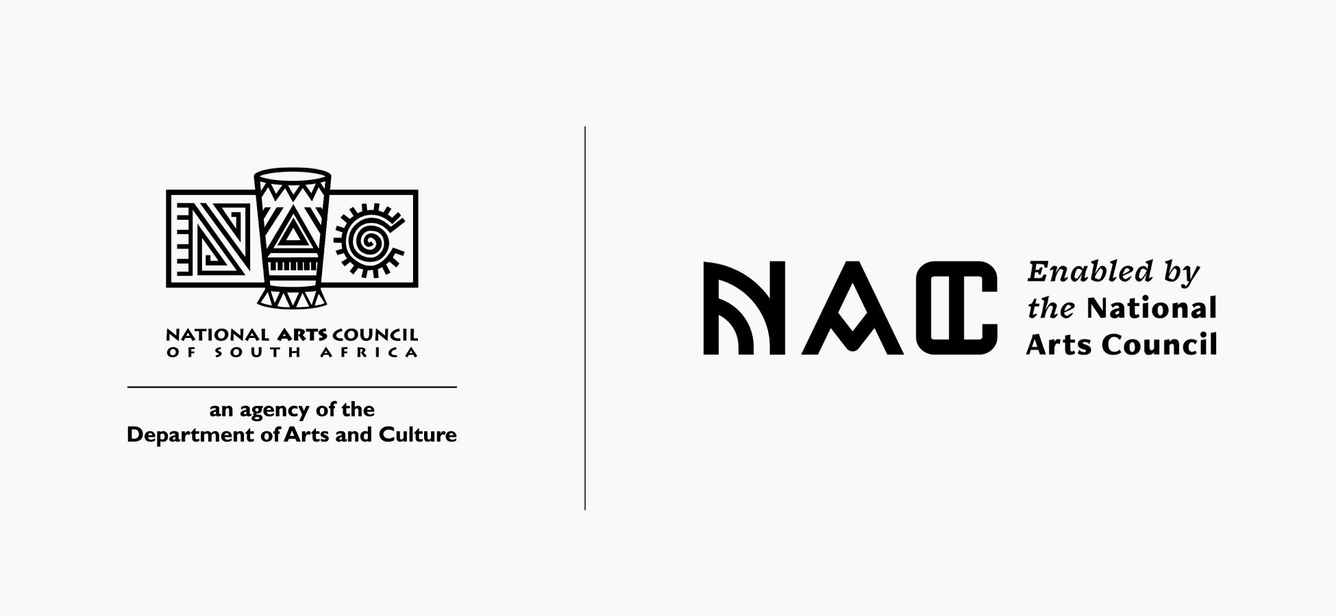
The National Arts Council connects South African artists to funding and development, supporting a rich and diverse arts sector. At twenty-four, its identity had dated. BBA Liminal evolved the mark, extended the palette, and built a patterning and icon language rooted in the country's arts and crafts heritage.
02 — The liminal moment
The National Arts Council came into being in 1994 as the Department of Arts and Culture's funding body, set up to invest in small arts organisations through grants and to back young artists with bursaries. Twenty-four years on, its identity had dated. The mark no longer matched a mandate that was looking forward — an enabler connecting the arts to funding and development, supporting the growth and sustainability of a diverse sector.
The NAC asked BBA Liminal to refresh that identity. The brief was a visual refresh. The deeper problem was alignment: an identity that could hold the NAC's purpose with cultural roots and a forward-looking outlook, and signal clearly what the institution is for — the enabler of the arts, connecting artists to the means to grow.

03 — The transformation
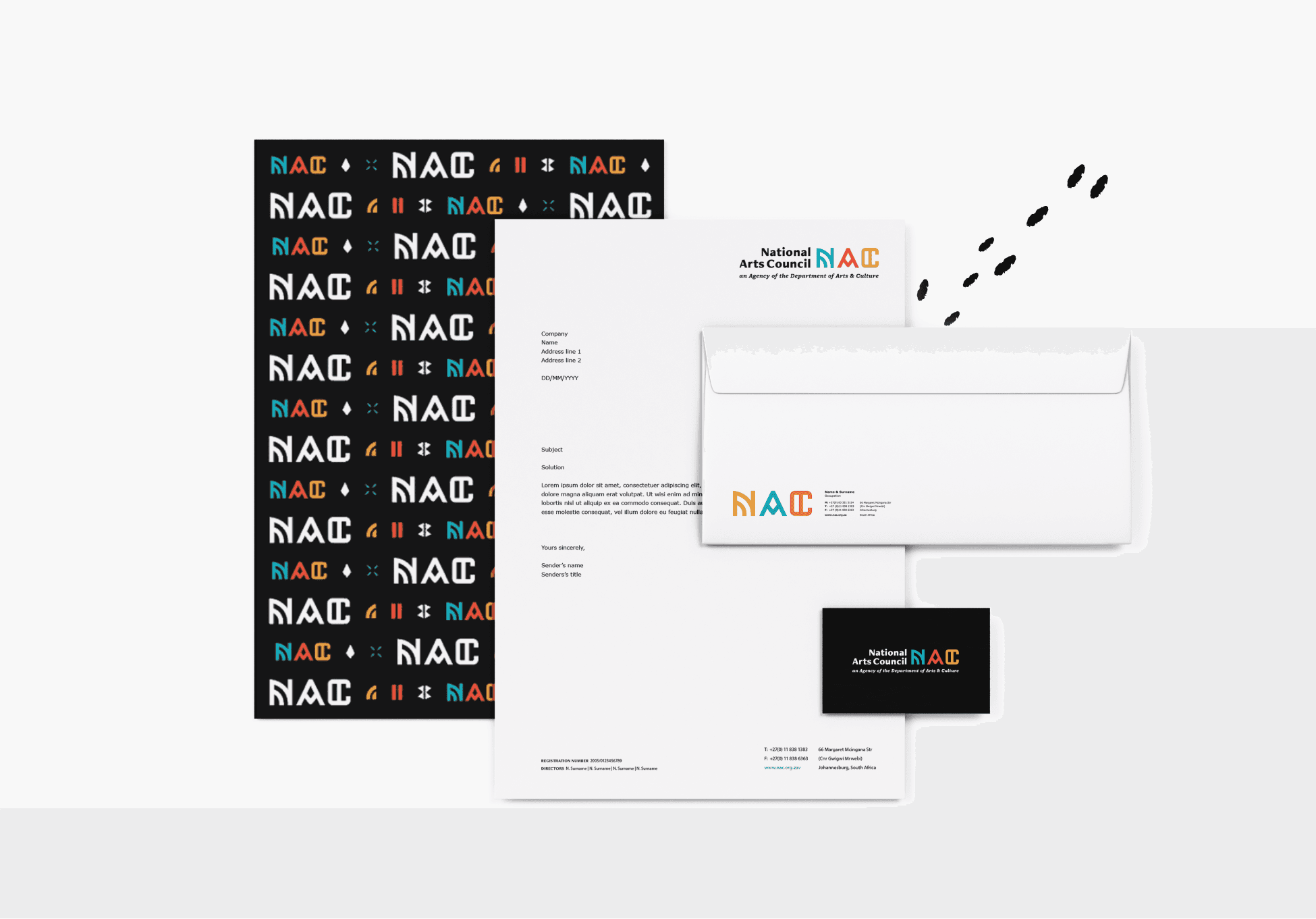
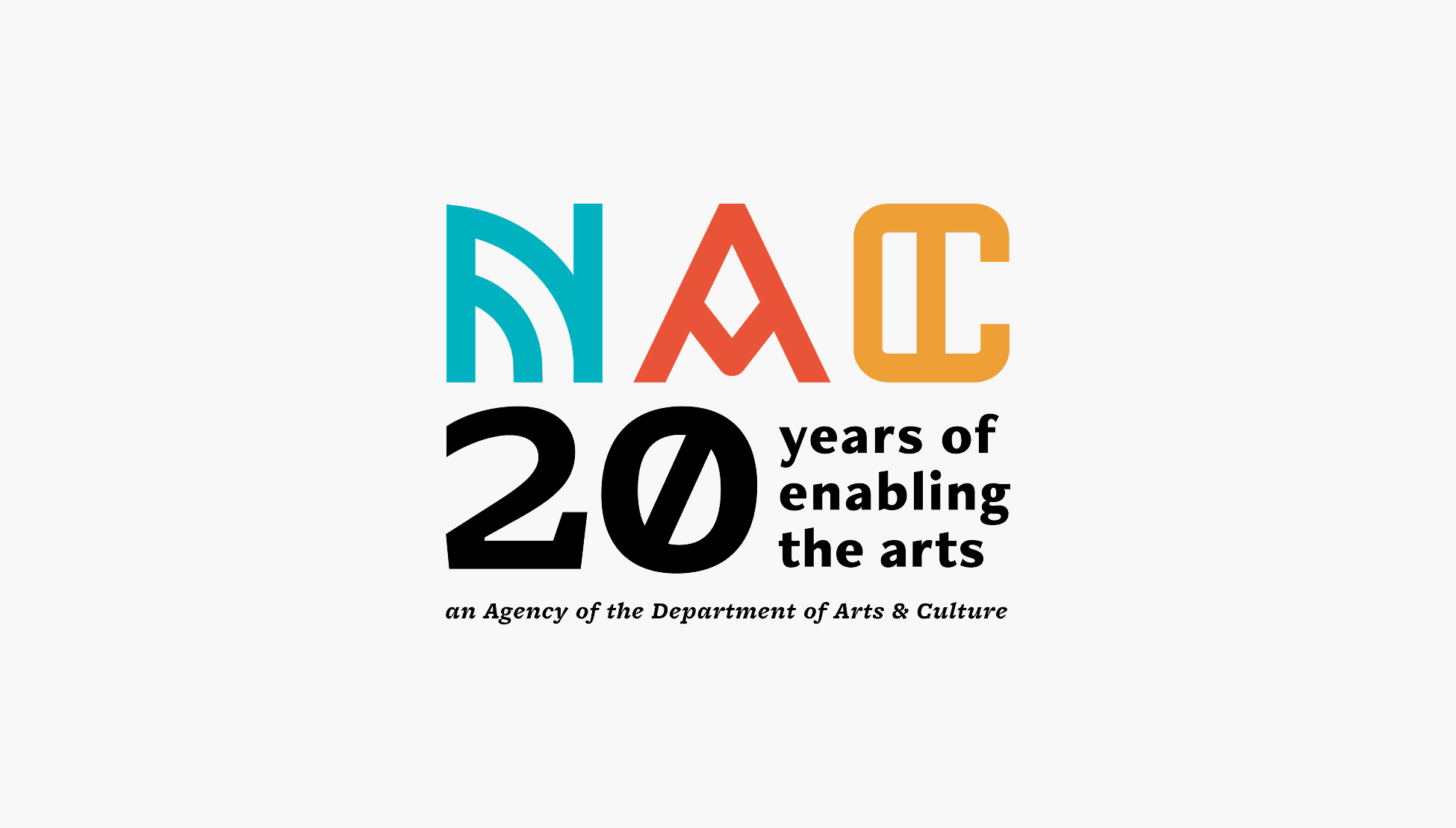
A refreshed identity that tells the story. We simplified and evolved the existing NAC logo, drawing on a visual language rooted in South Africa's arts and crafts heritage. The mark holds the three pillars of the NAC's work: diversity, connection and support.
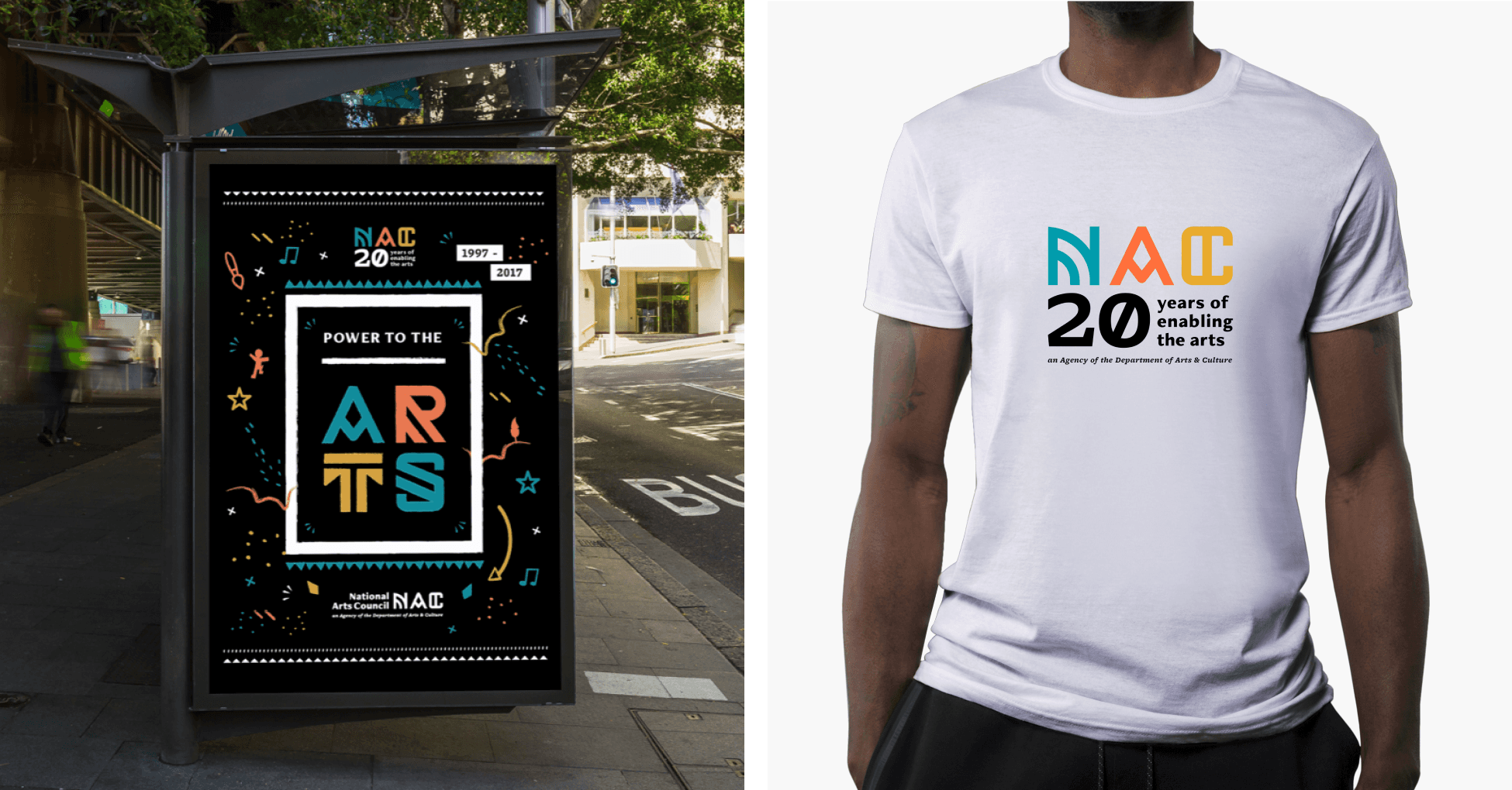
A palette built for range. We extended the brand's colours, introducing complementary and secondary tones so the identity could flex across the many applications a national funding body needs, from print to digital.
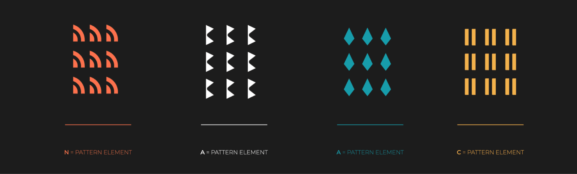
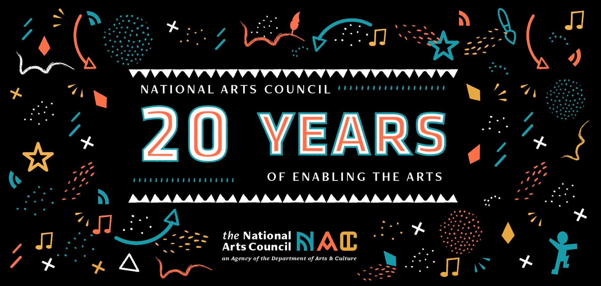
A visual language rooted in culture. We developed a patterning language from the logo for print, digital and collateral, and a set of stylised icons to communicate the different arts sectors the NAC connects and supports — making the breadth of its work legible at a glance.
04 — The craft
A bold mark for the enabler of the arts
An evolved logo holding diversity, connection and support; an extended palette for range; a patterning language and a set of stylised icons drawn from South Africa's arts and crafts — one identity for the body that connects artists to funding.
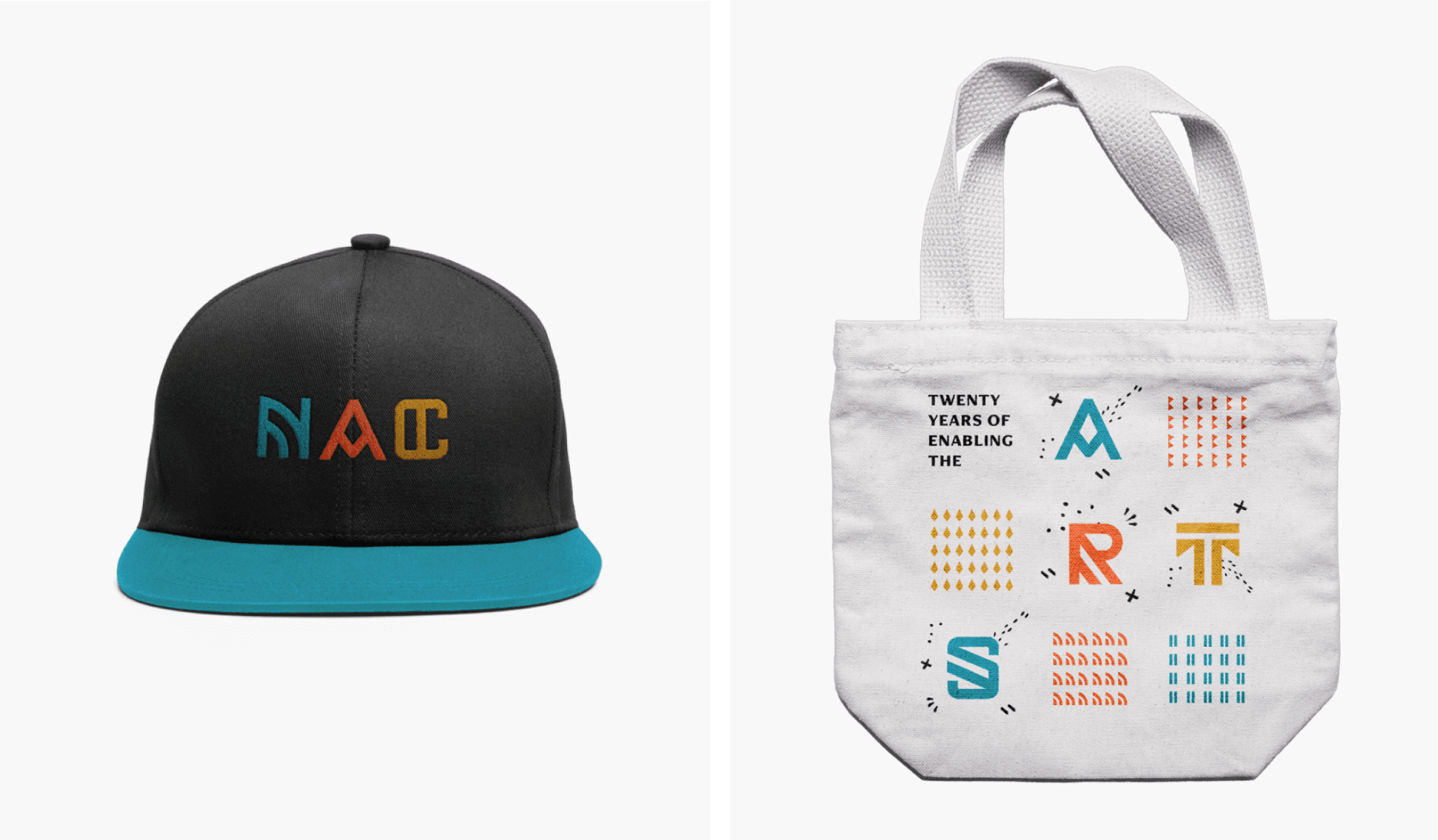
20 years of enabling the arts
Brand & communications strategy
Typography
Digital strategy
Brand identity design
Public value framing
Institutional communications
Brand platform development
Positioning & narrative