Alterra Capital Partners
Client: The Carlyle Group
Period:
Banking & finance

01 — The sneak-peek
Higher ground, in a single name
When The Carlyle Group spun its Africa fund out as an independent firm, BBA Liminal gave it a name and an identity of its own: Alterra Capital Partners, an Africa-focused private equity firm built on next-level, higher-ground thinking about investing on the continent.
02 — The liminal moment
Alterra Capital Partners began inside one of the largest investment houses in the world. In 2020 The Carlyle Group set out to spin its Africa fund out as a separate entity, with its own footing on the continent and its own story to tell. A fund that had always carried a global parent's name now needed one of its own.
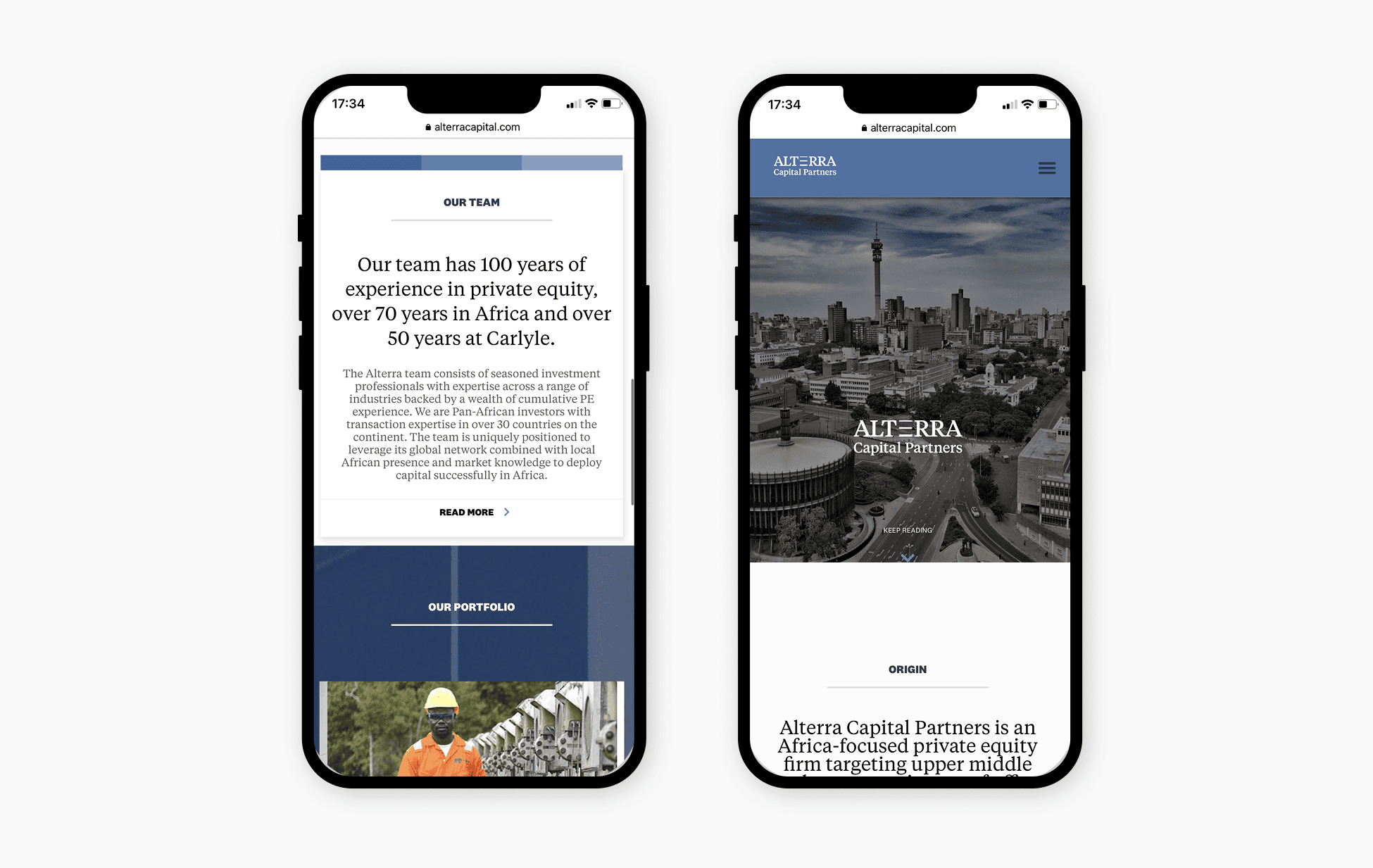
BBA Liminal was tasked with the renaming and rebranding of the firm — positioning, logo, website, and the working collateral of business cards, letterheads and templates. The brief was an identity for a new independent firm. The deeper problem was meaning and standing: a name and a presence that could signal serious, Africa-focused expertise to investors and partners worldwide, from the firm's first day as its own entity.
03 — The transformation
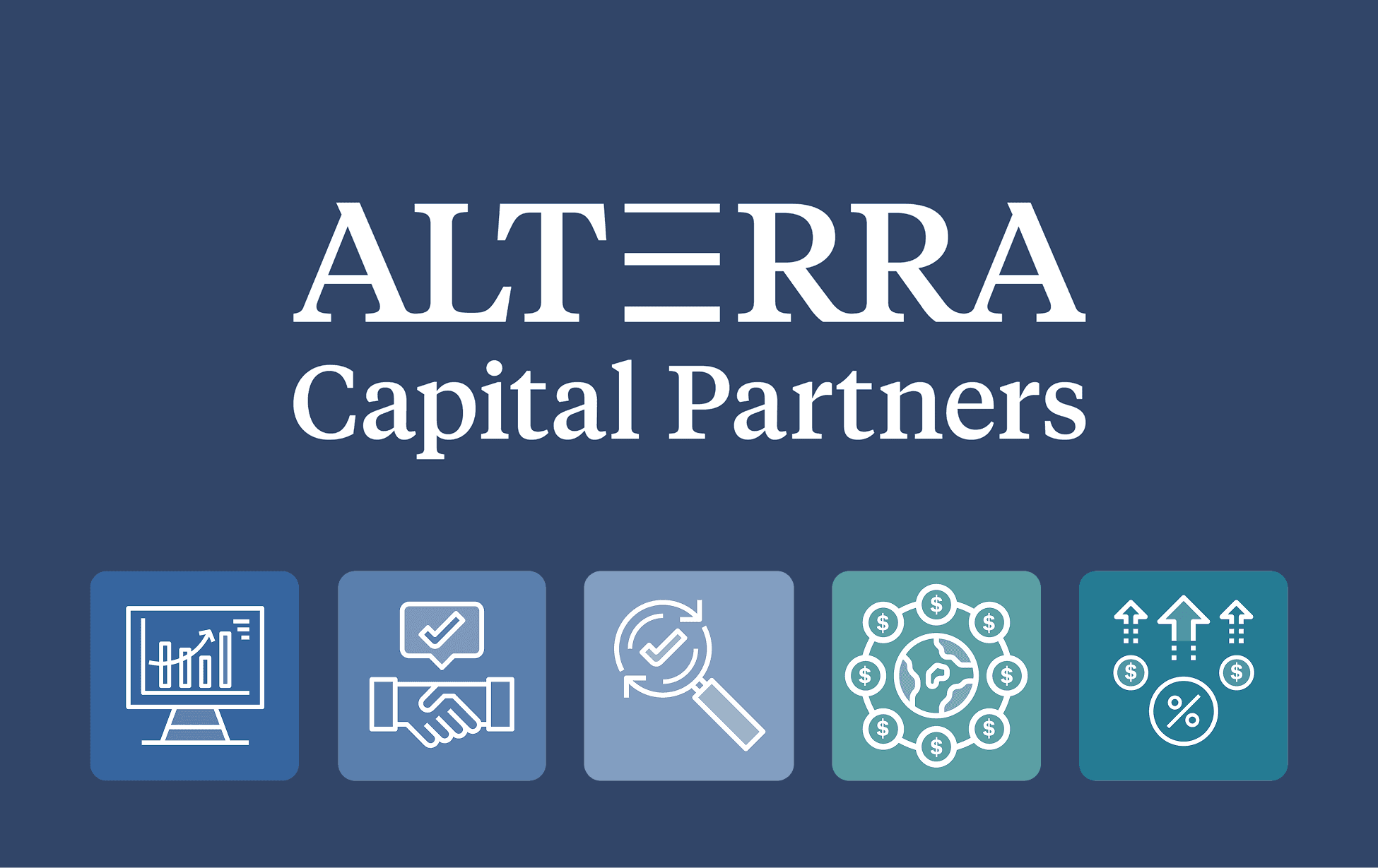
A name built on purpose. We named the firm Alterra — a Latin term for elevation, higher land, an alternative level. It speaks to the higher-ground expertise the team brings to investing in Africa, and gives a newly independent firm a clear idea to stand on.
A fresh identity for a shared name. Alterra is a name others use too, so the identity had to make it unmistakably theirs. We let the E in Alterra carry the idea of growing wealth and next-level financial thinking, and stepped away from the obvious peaks-and-mountains reading of higher ground.
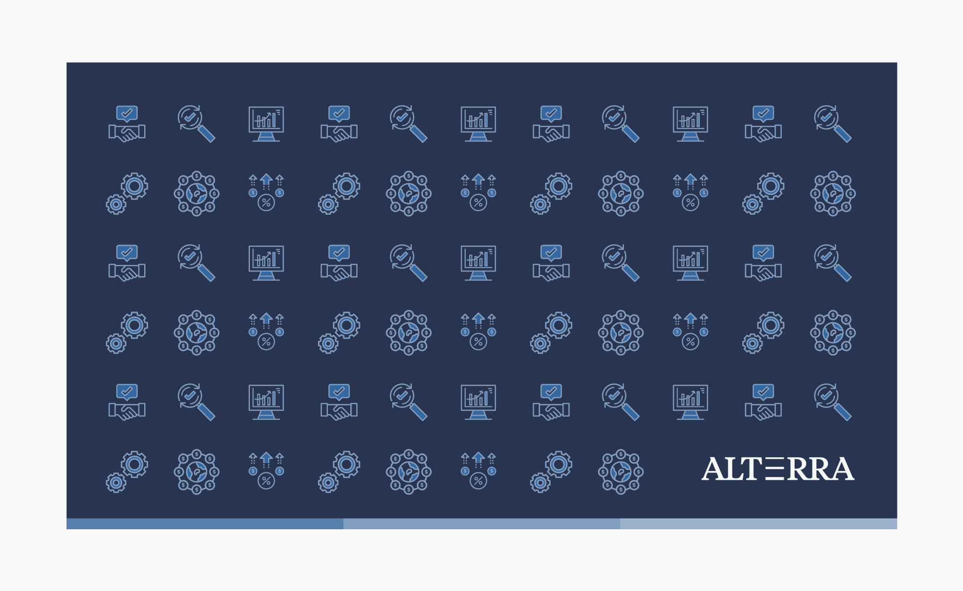
Just the right type. We built the logo in Tiempos, from KLIM Type Foundry — contemporary, robust and clear, made for legible, economical typesetting. Simple, striking elements put a fresh spin on the financial ideas of elevation and growth, carried through the website and the collateral.
04 — The craft
Elevation, made legible
A name drawn from the Latin for higher ground, an identity that finds its idea in a single letter, and Tiempos type to carry it — across logo, website, business cards, letterheads and templates.


Naming
Brand & communications strategy
Typography
Brand identity design
Brand platform development
Positioning & narrative


