Mwamba Agri
Client: Yellowwoods Impact Sourcing Platform
Period: 2024
Sustainable development


02 The liminal moment
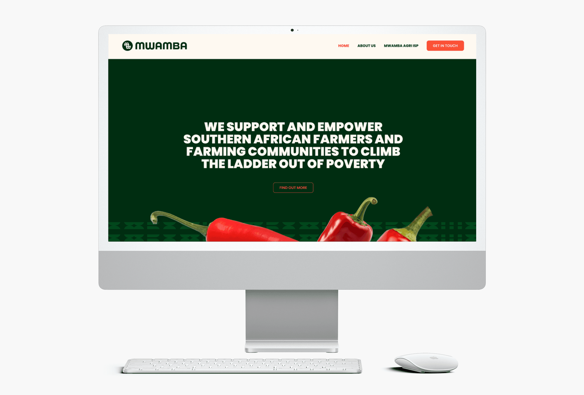
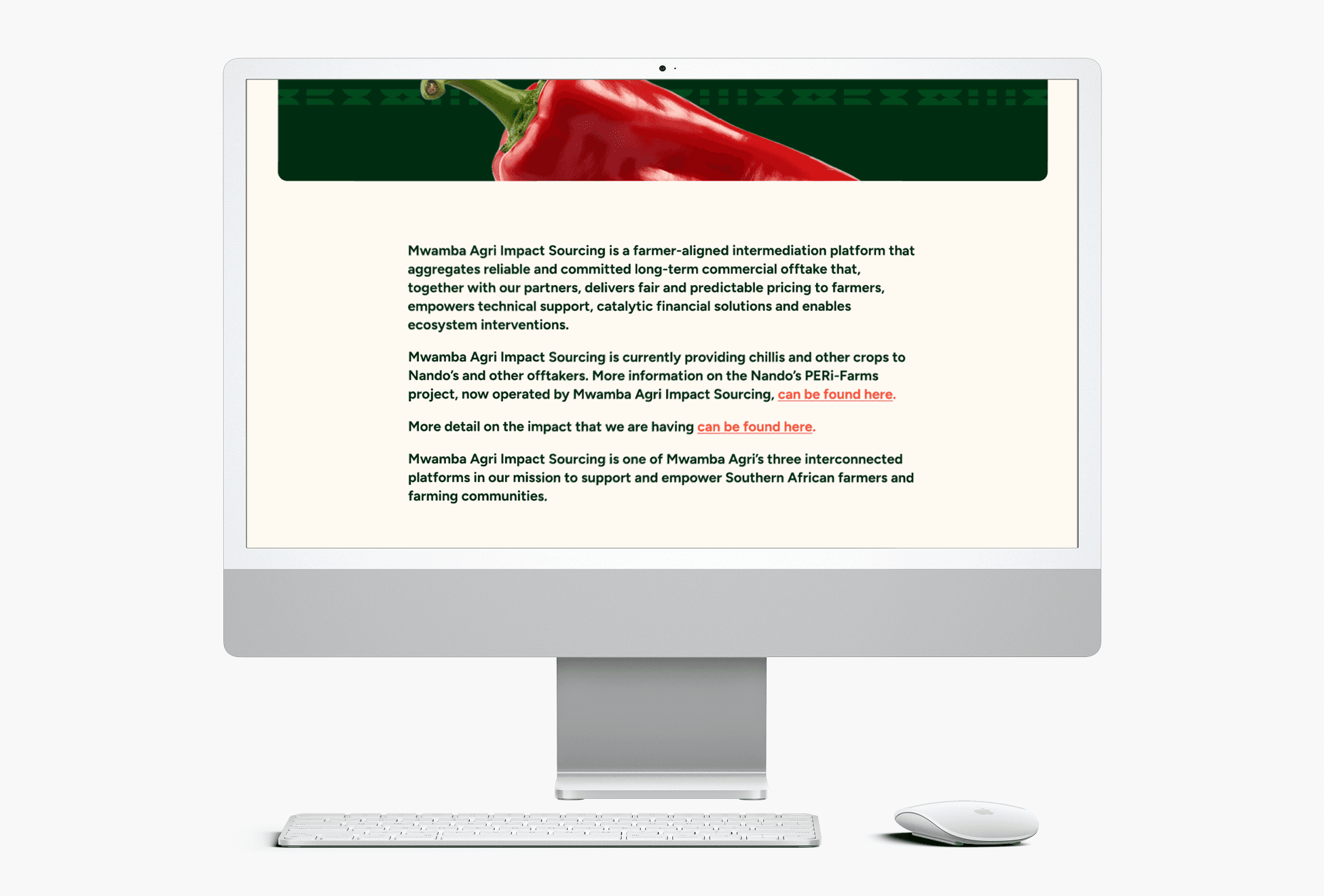
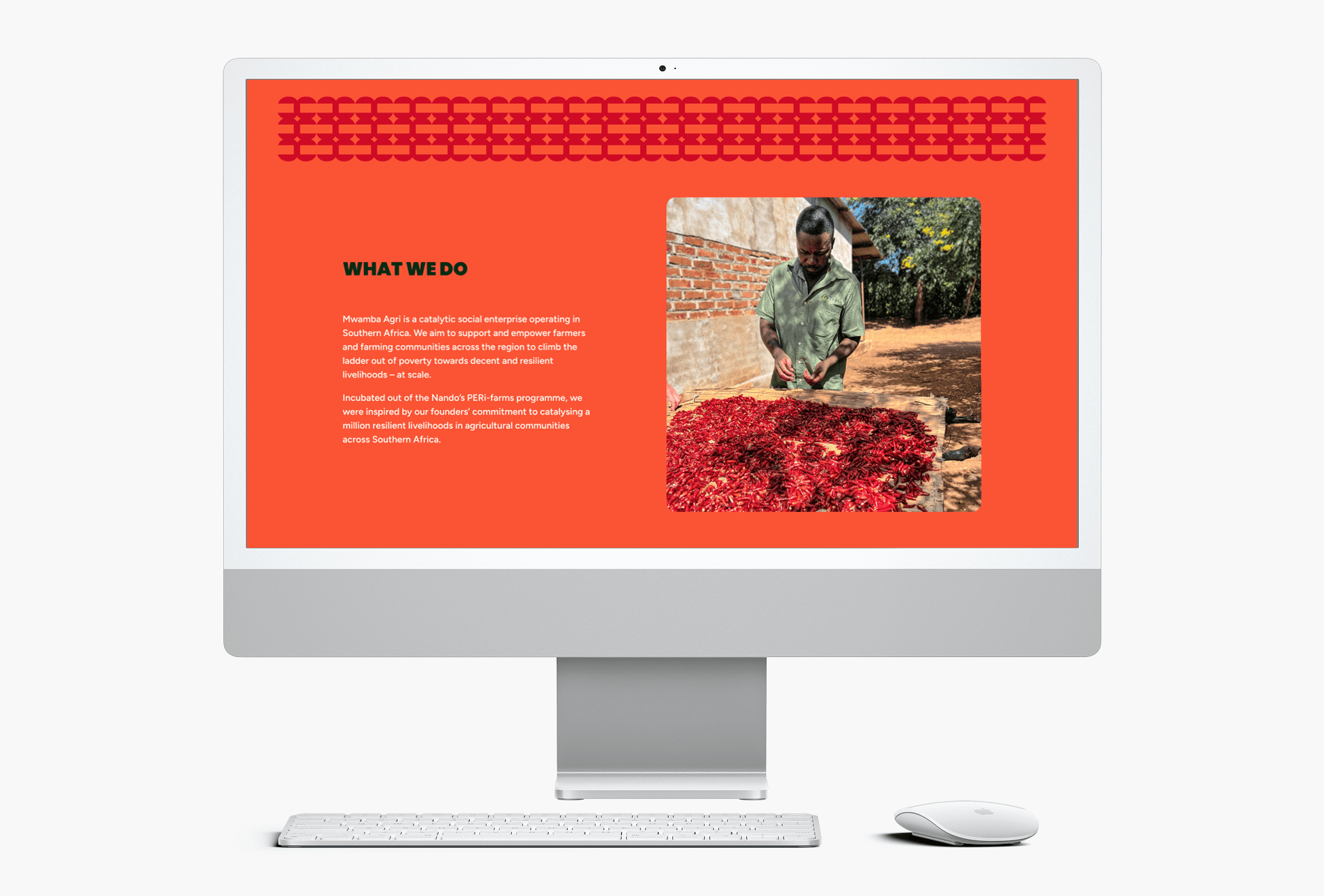
Yellowwoods came to us with something that did not yet have a name. Their impact-sourcing platform — connecting farmers with reliable, committed corporate buyers through fair and predictable pricing, technical support, catalytic finance and ecosystem interventions — needed an identity equal to its purpose: sustainable agriculture, and farming communities lifted towards resilient livelihoods.
The brief was a name and a brand identity, carried through typography, colour, photography, vector elements and patterns. The harder task was everything the identity had to hold at once: trust and professionalism for corporate buyers; warmth and respect for the farmers and communities at the centre; a place in the Yellowwoods family of brands; and a distinct character of its own. The platform was at its starting threshold — and the name would set the terms for everything that followed.
03 The transformation
We rooted the name in meaning. Drawing on our understanding of sustainable agriculture and value-chain work, we crafted a name rooted in indigenous meaning — one that holds the helping hand Mwamba offers the farmers and communities it serves. The name set the tone for the identity around it.
We designed with purpose. Through considered typography, colour and pattern, we built an identity that carries trust, sustainability and partnership — answering questions of food safety and brand perception, and making room for value-driven, collaborative relationships across the value chain.
We made it at home in a family of brands. Yellowwoods is also home to brands such as Nando's. We shaped the palette and iconography to pay subtle homage to that family while keeping Mwamba Agri distinct and its own — connected, but standing on its own ground.
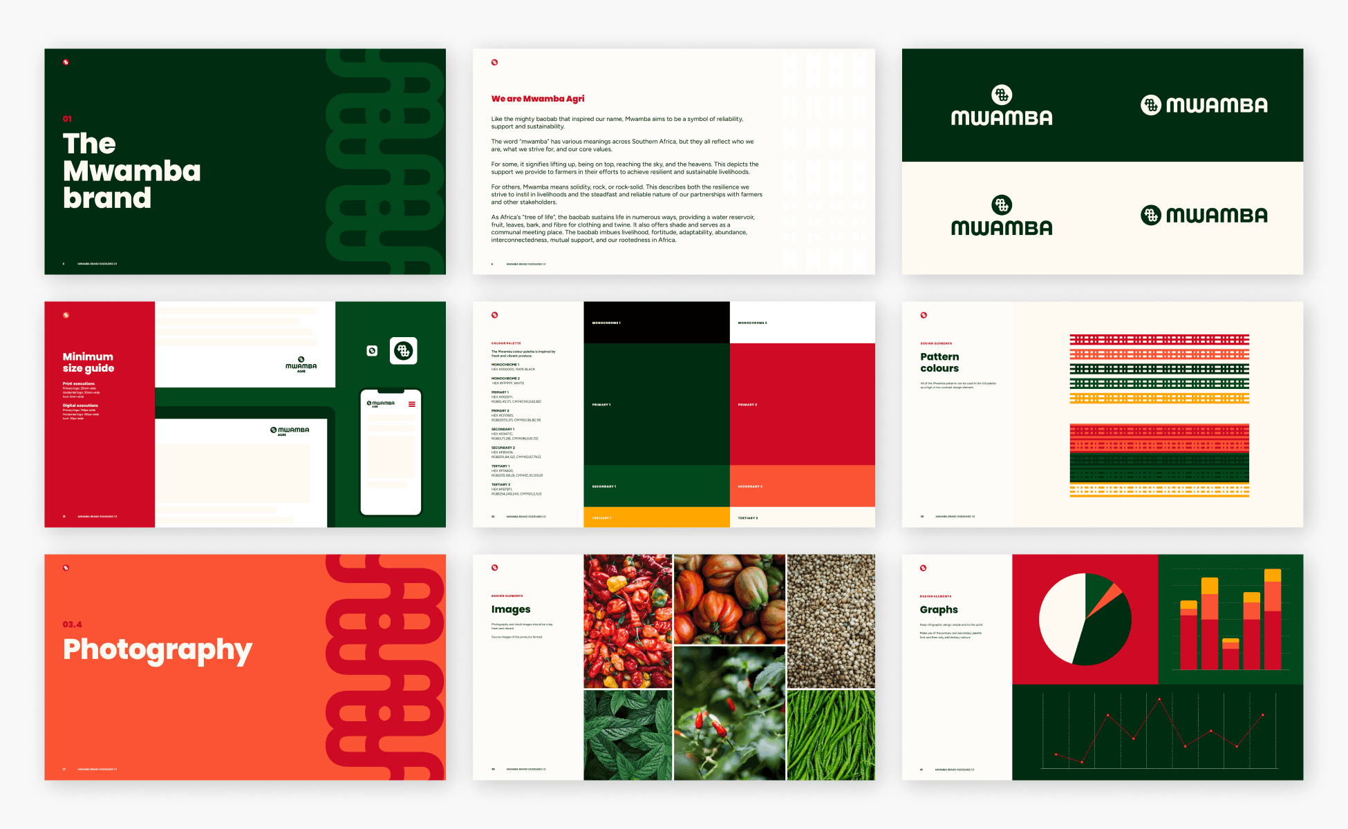
04 The craft
Mwamba Agri — the helping hand, made visible
An identity that carries trust to corporate buyers and respect to the farmers at its centre, in one coherent system: logotype, typography, a purpose-led palette, photography direction, vector elements and patterns.
Naming
Brand & communications strategy
Typography
Brand identity design
Positioning & narrative


