National Arts Festival rebrand
Client: National Arts Festival
Period: 2024 - 2025
Not-for-profit & civil society
Arts, culture & heritage

01 The sneak peek
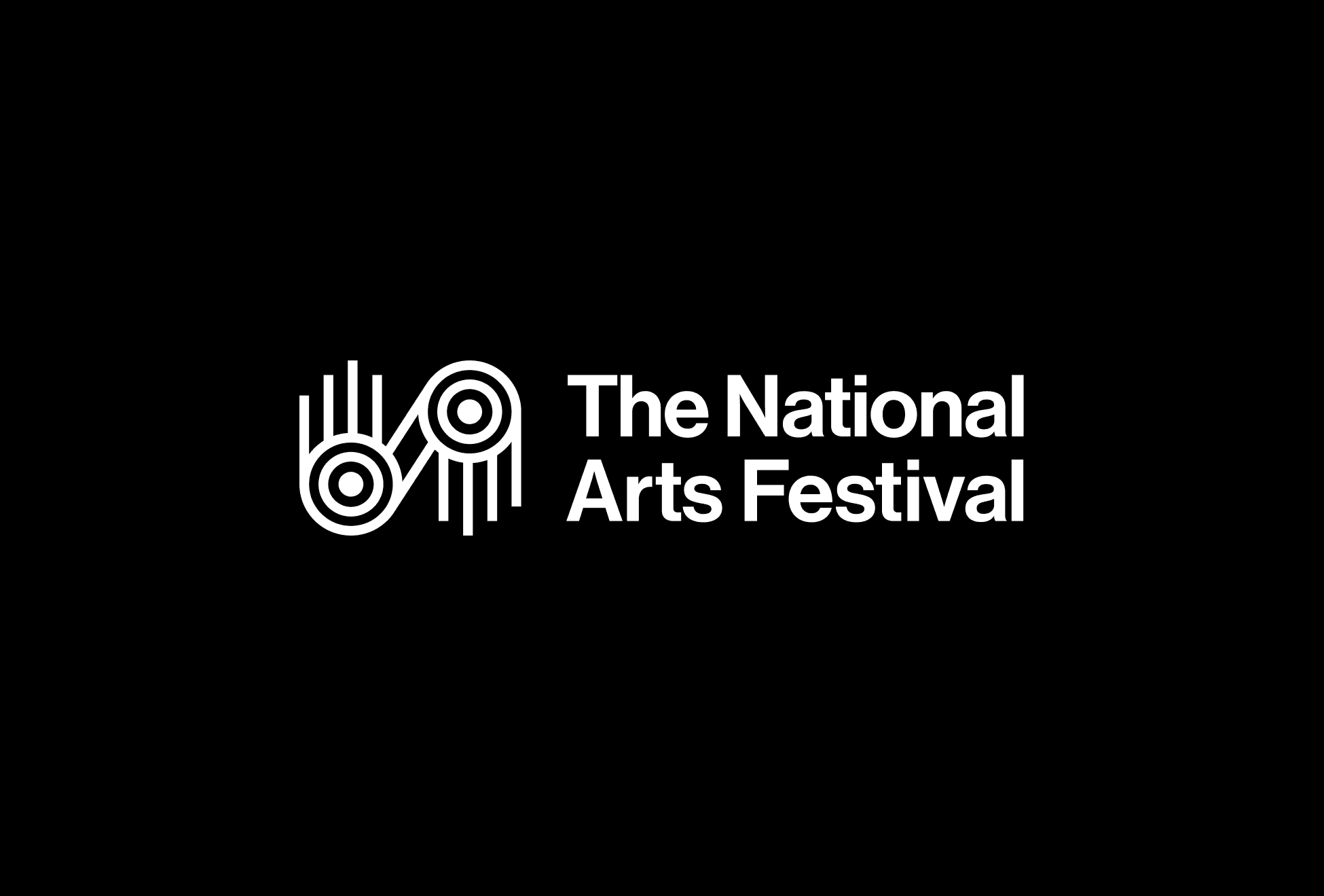
An identity that moves to the rhythm of a nation
For the National Arts Festival's fiftieth, we created an identity rooted in South Africa's visual heritage — distinctly local yet owned by no single tradition, built to flex across the Festival's many programmes and to position it as Umama wezobugcisa: the mother of the arts.
02 The liminal moment
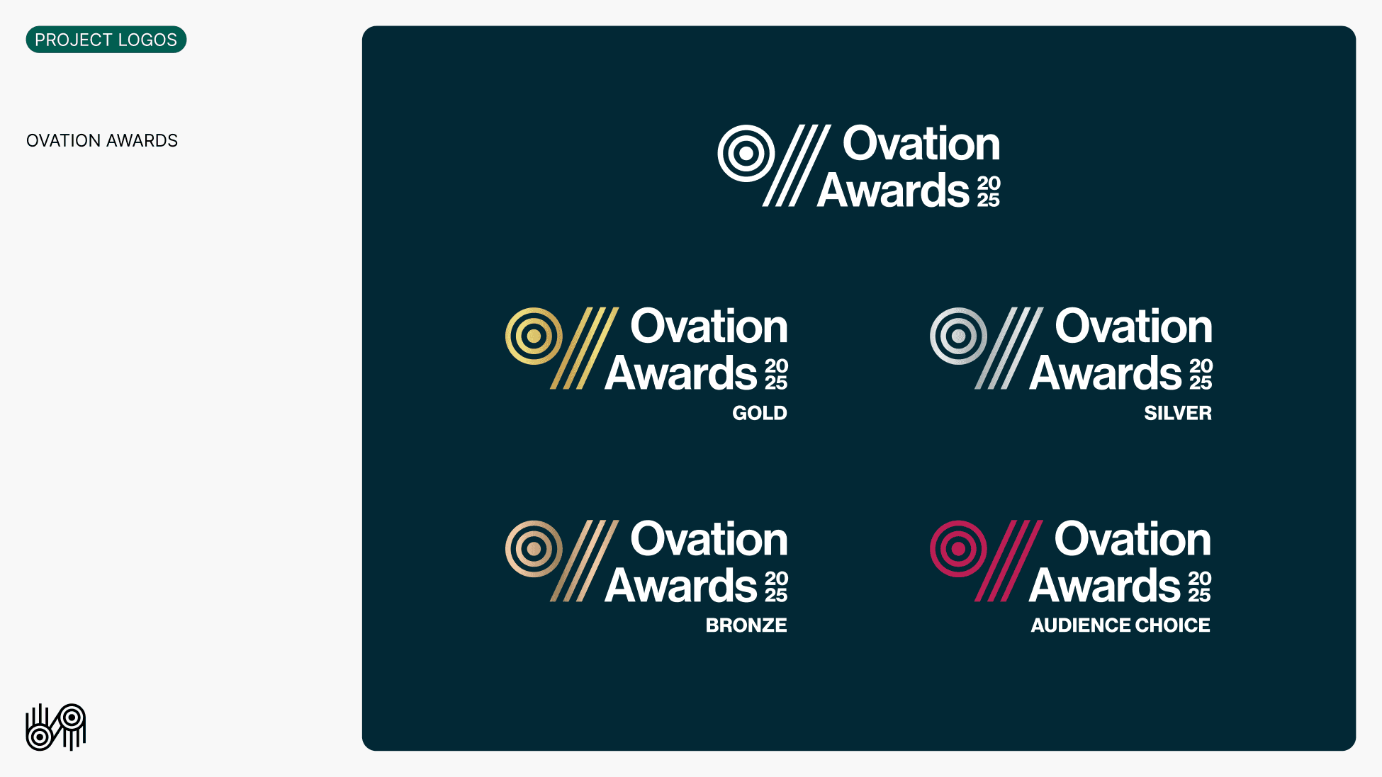
For fifty years, the National Arts Festival has been the continent's most significant gathering of the arts. Its fiftieth was a threshold of a particular kind: after decades of sponsor-led naming, the Festival was reclaiming its own name and identity — an act of institutional independence and cultural ownership, not a cosmetic refresh. The work had to honour fifty years of heritage while signalling what comes next; hold a family of programmes — The Fringe, the National Jazz Festival, the Eastern Cape Showcase — each with its own recognition but one shared identity; feel authentically South African without appropriating any single tradition; and speak from emerging artists to international visitors. The brief was a visual system for the anniversary. The deeper task was to give a fifty-year-old institution back its own face — and a purpose to stand on: Umama wezobugcisa, the mother of the arts.
03 The transformation
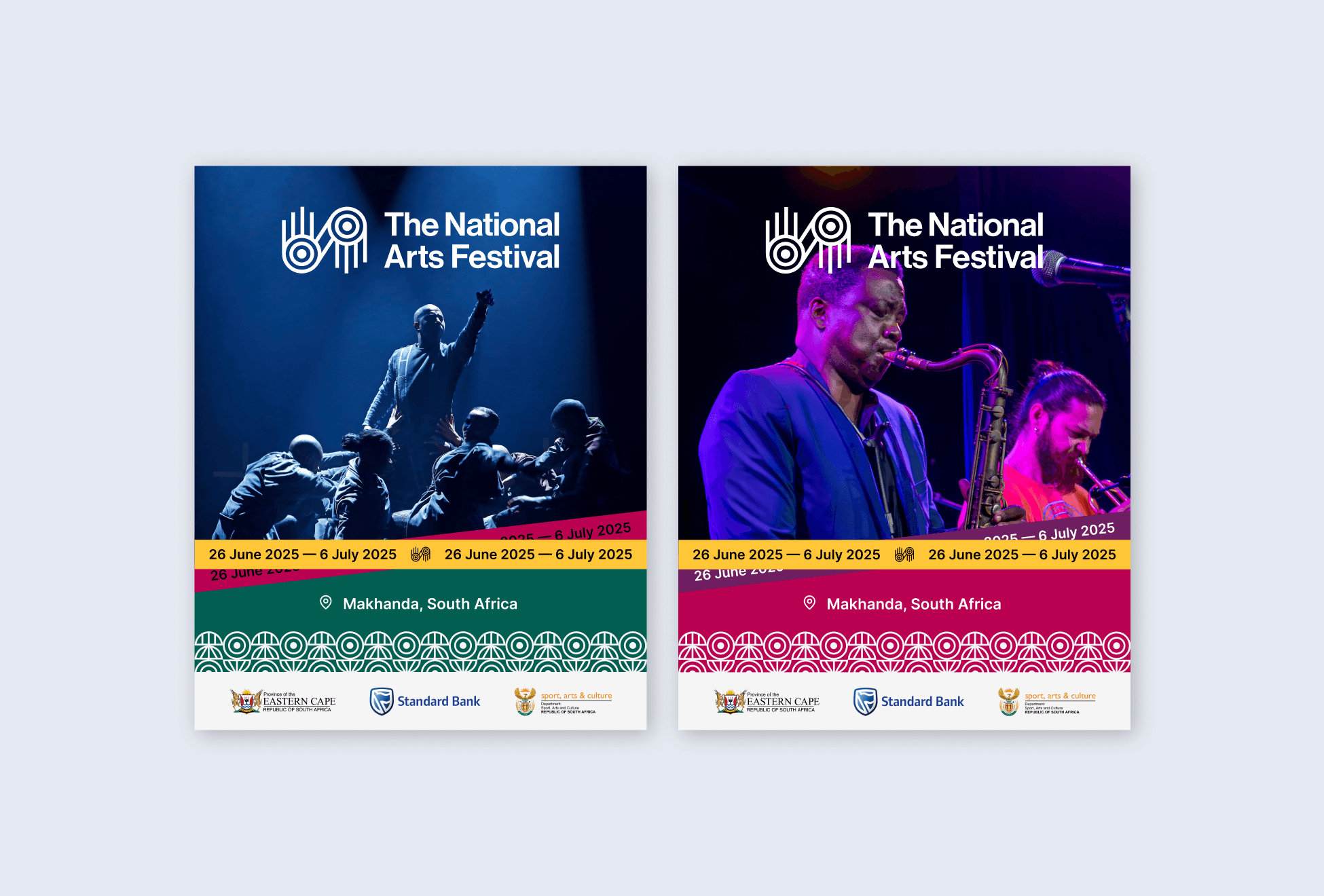
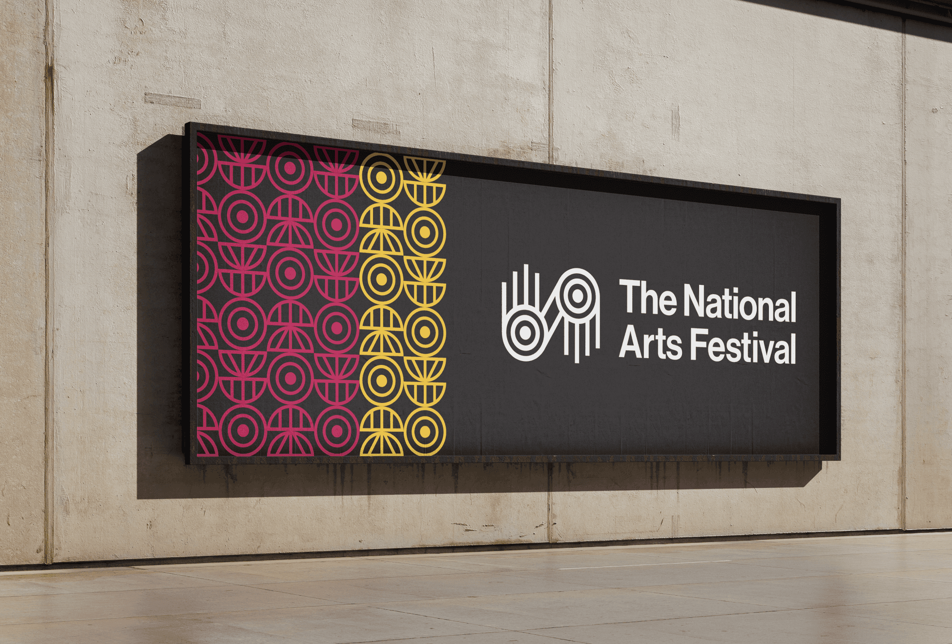
We built a visual language from South Africa's heritage that belongs to no single tradition. That deliberate universality is the point: every South African can see themselves in it, without appropriation. The pattern became a national language — local, plural, and the Festival's own.
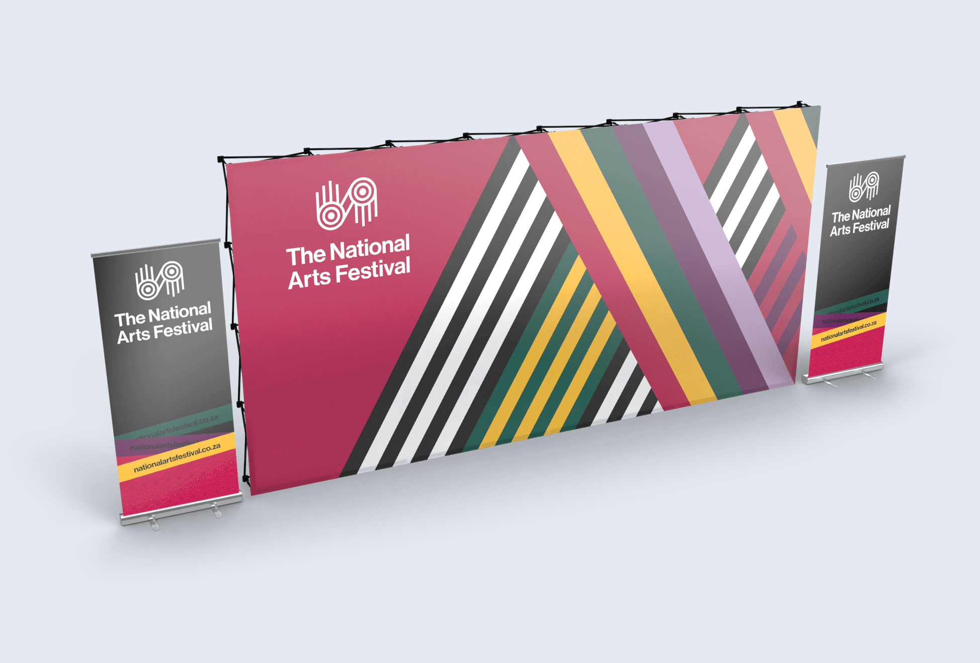
We engineered the system to flex. Each programme carries its own pattern combination while sharing the same typographic and structural DNA — instant family recognition, distinct personalities — and it can expand or contract as the programming does, without losing itself.
We let the purpose shape the form. Umama wezobugcisa — mother of the arts — translated into rounded, nurturing shapes, so the maternal positioning is felt, not just stated. And clear rules for colour, scale and typography mean any designer can extend it without diluting it, lowering cost while holding consistency.

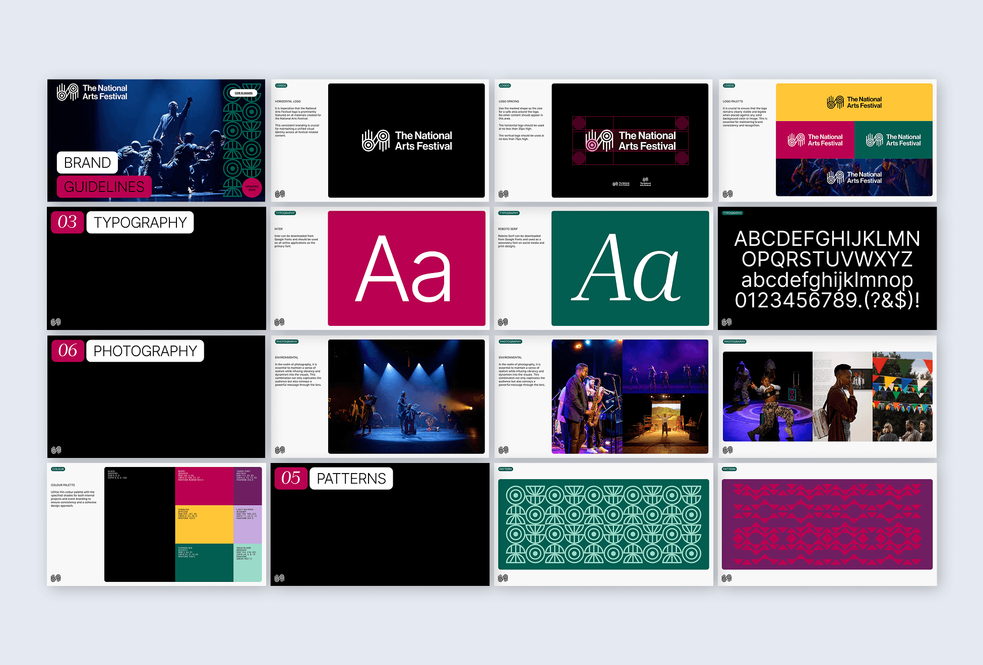
04 The craft
Pattern as national language, typography as heritage
The identity is distinctly South African and owned by everyone — rooted in heritage, rounded and warm in form, and built as a system rather than a logo, so it can live across fifty years of programmes and grow with the Festival.
05 The validation of purpose
The work held where it mattered: at fifty, the National Arts Festival took back its own identity. The system gives it independence from sponsor-led naming, a face that belongs to the whole country, and a framework its own team and future partners can carry forward without losing coherence — an institution standing, again, on its own purpose as the mother of the arts.
50 years
Identity reclaimed
Umama wezobugcisa
Brand identity design
Public value framing
Institutional communications
Positioning & narrative
Purpose architecture


