AJABU Spirits & Cocktails Festival
Client: AJABU
Period: 2024
Hospitality & leisure

01 The sneak-peek
An identity as crafted as the cocktails.
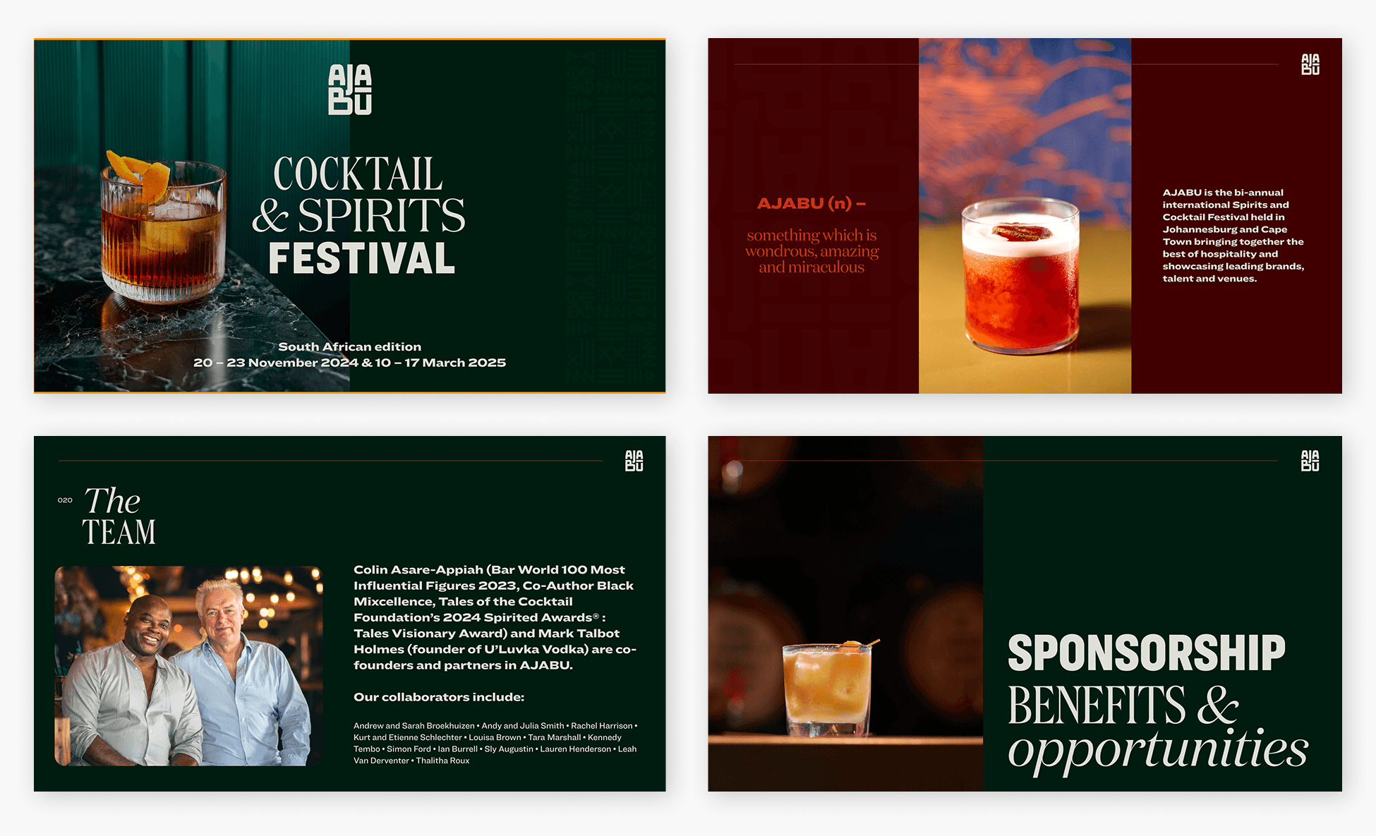
AJABU is Africa's spirits and cocktails festival, hosted in Johannesburg and Cape Town. BBA Liminal rebranded it — a hand-rendered mark rooted in indigenous knowledge systems and Afro-optimism, and a visual system that positions the festival as a platform for African hospitality and mixology.

02 The liminal moment
AJABU set out to be the platform for African hospitality and mixology — a festival showcasing the continent's talent in Johannesburg and Cape Town, for audiences at home and abroad. To claim that place, it needed an identity equal to the ambition.
Our mandate was a strategic rebrand: a contemporary identity that honours African excellence while positioning the festival as a catalyst for the industry. The brief called for a sophisticated brand mark rooted in indigenous knowledge systems and Afro-optimism, with bespoke assets to carry its purpose. The deeper challenge was a balance the festival lives on — a visual language authentically African in its roots, and sophisticated enough to meet international audiences, capturing both the precision and the artistry of mixology while holding its African resonance.

03 The transformation
We made a mark by hand. We merged Afro-optimism with indigenous knowledge systems into a bespoke, hand-rendered brand mark — drawing on the nuance of African script while holding the sophistication of mixology. A distinctive identity, rooted and contemporary at once.
We let African forms lead, met by craft. African symbolism anchors the framework, met by considered typography — the alchemy of collaboration made visible. The blend creates an inclusive visual language that honours African culture, people and craft, and carries it to audiences across the continent and the world.
We let colour and the human hand carry it. A refined palette drawn from craft spirits sets the tone, while our photography direction centres diverse hands in creation — revealing the character of each drink, and connecting AJABU with audiences at home and abroad.

04 The craft
Contemporary sophistication, grounded in indigenous knowledge
A festival identity as crafted as the drinks it celebrates: a hand-rendered mark, a palette drawn from craft spirits, and photography that centres the hands doing the making — a refined, purposeful system carried across every surface.
Social media

Sponsorship deck
Coaster designs

01 The sneak-peek
An identity as crafted as the cocktails.
AJABU is Africa's spirits and cocktails festival, hosted in Johannesburg and Cape Town. BBA Liminal rebranded it — a hand-rendered mark rooted in indigenous knowledge systems and Afro-optimism, and a visual system that positions the festival as a platform for African hospitality and mixology.
02 The liminal moment
AJABU set out to be the platform for African hospitality and mixology — a festival showcasing the continent's talent in Johannesburg and Cape Town, for audiences at home and abroad. To claim that place, it needed an identity equal to the ambition.
Our mandate was a strategic rebrand: a contemporary identity that honours African excellence while positioning the festival as a catalyst for the industry. The brief called for a sophisticated brand mark rooted in indigenous knowledge systems and Afro-optimism, with bespoke assets to carry its purpose. The deeper challenge was a balance the festival lives on — a visual language authentically African in its roots, and sophisticated enough to meet international audiences, capturing both the precision and the artistry of mixology while holding its African resonance.
03 The transformation
We made a mark by hand. We merged Afro-optimism with indigenous knowledge systems into a bespoke, hand-rendered brand mark — drawing on the nuance of African script while holding the sophistication of mixology. A distinctive identity, rooted and contemporary at once.
We let African forms lead, met by craft. African symbolism anchors the framework, met by considered typography — the alchemy of collaboration made visible. The blend creates an inclusive visual language that honours African culture, people and craft, and carries it to audiences across the continent and the world.
We let colour and the human hand carry it. A refined palette drawn from craft spirits sets the tone, while our photography direction centres diverse hands in creation — revealing the character of each drink, and connecting AJABU with audiences at home and abroad.
04 The craft
Contemporary sophistication, grounded in indigenous knowledge
A festival identity as crafted as the drinks it celebrates: a hand-rendered mark, a palette drawn from craft spirits, and photography that centres the hands doing the making — a refined, purposeful system carried across every surface.
Social media
Sponsorship deck
Coaster designs
Brand & communications strategy
Typography
Copywriting
Event & convening design
Publication & editorial design
Brand identity design
Positioning & narrative


